
Credit builder is the second product of Brigit. This case study is meant to tell the story of the process my team went through to launch our second major product. Through this process we found the surface area of the product and today help thousands of Americans build their credit scores.
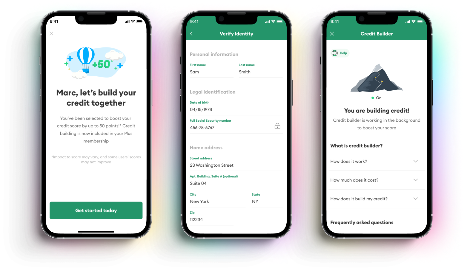
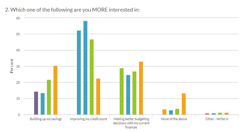
In our polls and research initiatives among different demographics, improving credit score consistently ranked at or near the top of most requested features for Brigit.
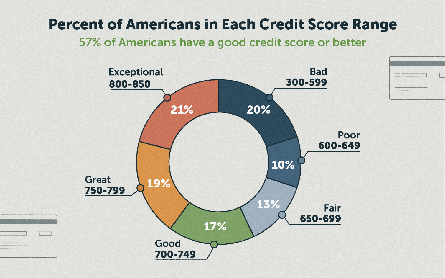
The key statistic:
26 million American adults are considered to be credit invisible. This no access to critical financing like auto loans, rent, and other key financial services. 40% of American credit scores have >700 credit scores.
Before I dive any further, it's important to explain how the product will actually work from a finance-engineering standpoint.
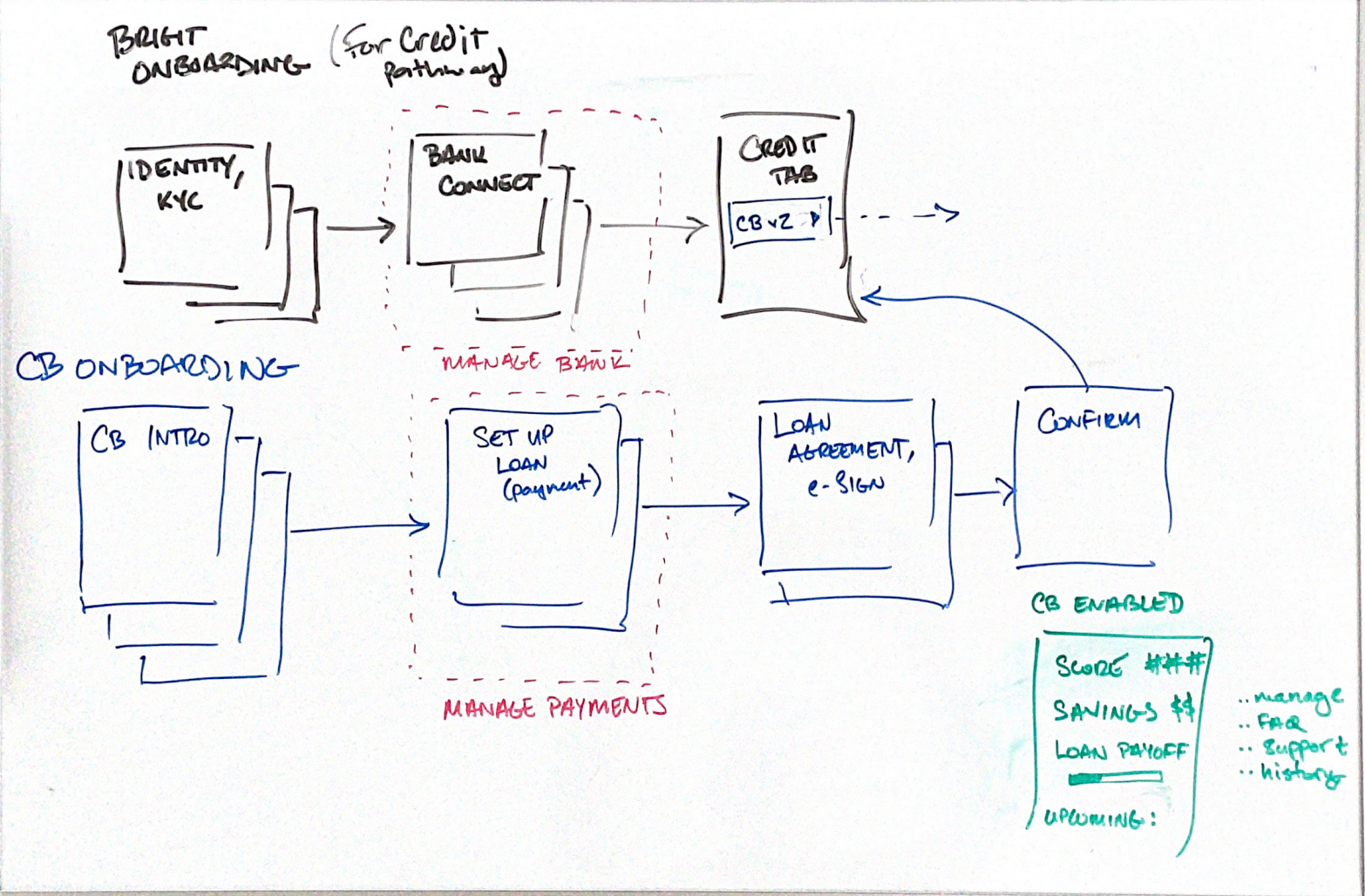
As you can see, the back-end is somewhat complicated, but I knew this was important to understand. I took this process and broke it down into 3 main steps that would make it easy to explain to anyone:
We chose to launch with a design sprint for 2 main reasons:
of the sprint sprint happened in the product concept stage, where we decided on the story we were going to use as a vehicle for explaining how this product would work.
The top 3 concepts we voted on were:
1. Build credit is tough, like climbing a mountain, and we will be your guide throughout this journey
2. Build your credit fast with Brigit
3. Tell us what your needs are and we will help you build credit based on those parameters
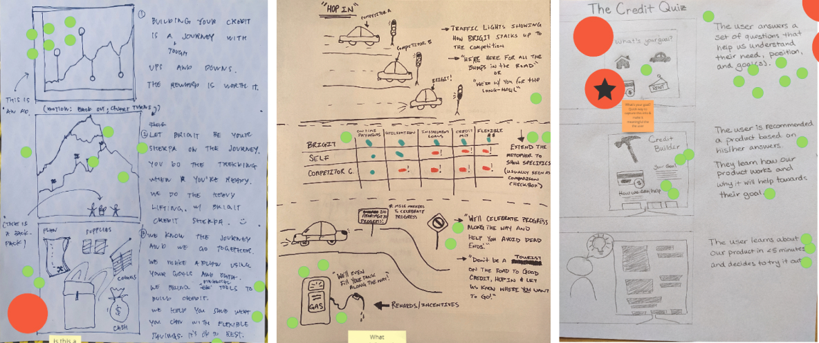
After much star voting and discussion, we settled on this story:
Building credit is a mountain you climb. Brigit will give you the plan, supplies, and financing to equip you on this journey.
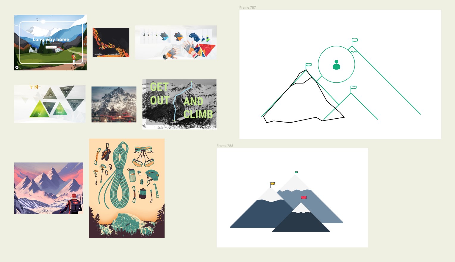
The concept we voted on ended up being credit as a journey - building credit as a metaphor to climbing a mountain - with us providing supplies, guidance, and cash to support your journey.
Responsibility of writing the user journey was given to me. I first defined the main touchpoints before writing out the full experience found in this gigantic PDF.
Since the content itself is so complicated, we should aim for the design elements to be as invisible as possible, while retaining a pleasant and familiar visual hierarchy.
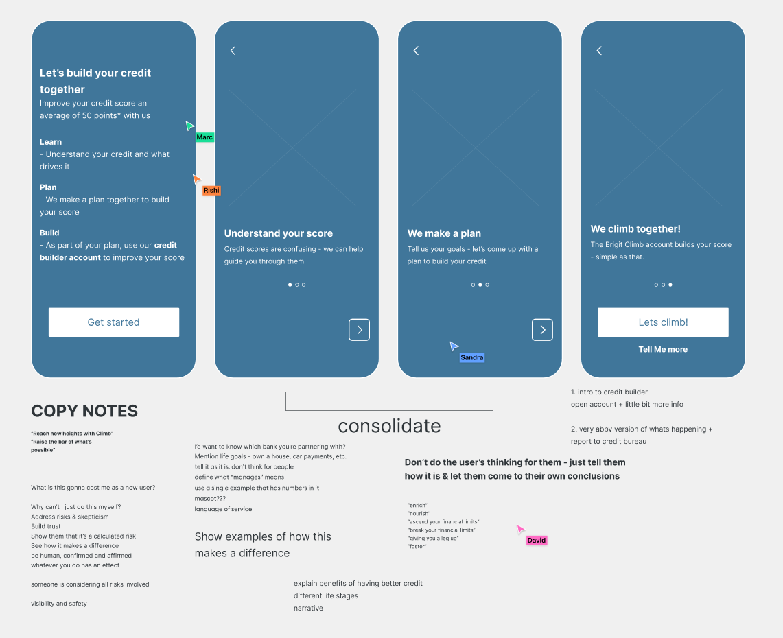
Is it possible? After getting the green light from compliance and engineering team to see if this product construct was feasible, we began to work on the onboarding.
My first exploration resembled onboarding for typical apps that have straightforward functions. The critique for this was that it was too vague and it didn't really explain how the product worked.
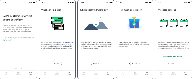
This was my second iteration. I went overboard with the copy and tried too hard to explain it. I went back to the drawing board and redesign it to be more “punchy.“
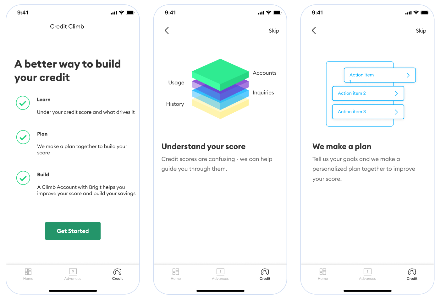
I condensed the copy as best as I could while still explaining sufficiently how the product worked. We had a lot of regulatory constraints, ie: we can't say "we help you open a loan and pay it back for you," because that wouldn't sufficiently prove credit-worthiness to the big 3, so needless to say it was no easy task.
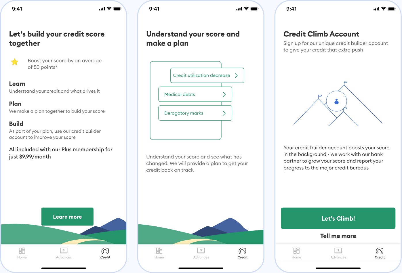
I took a much firmer lead when creating this version:
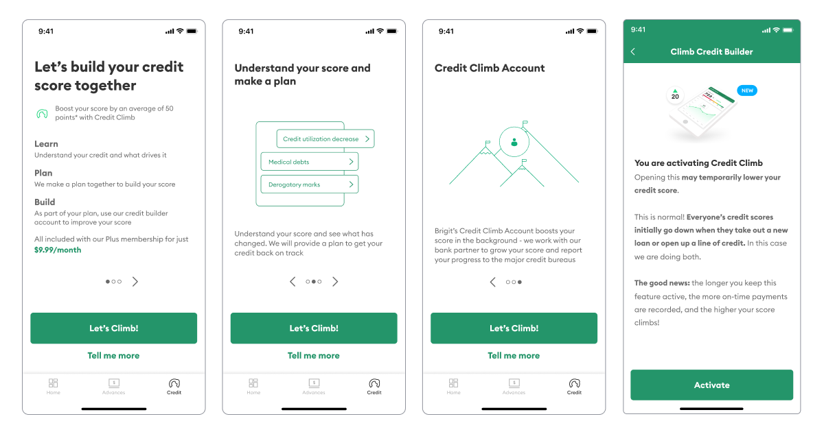
With the designs finished, I used my amazing Figma knowledge to connect rectangles together to create the prototype below
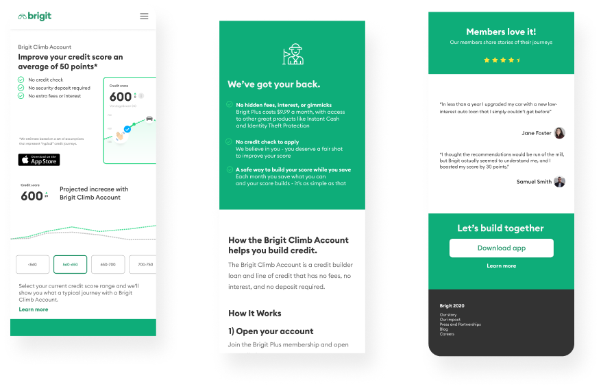
Because this is a new product, coming from a young fintech startup, I decided that this page should answer:
To respect resource constraints, I opted to use standard and modern landing page design patterns while retaining Brigit's branding.
Having content framed by familiar elements minimizes noise.
We tested the prototype with 7 users we recruited from userinterviews.com as having similar characteristics to our ideal credit builder population.
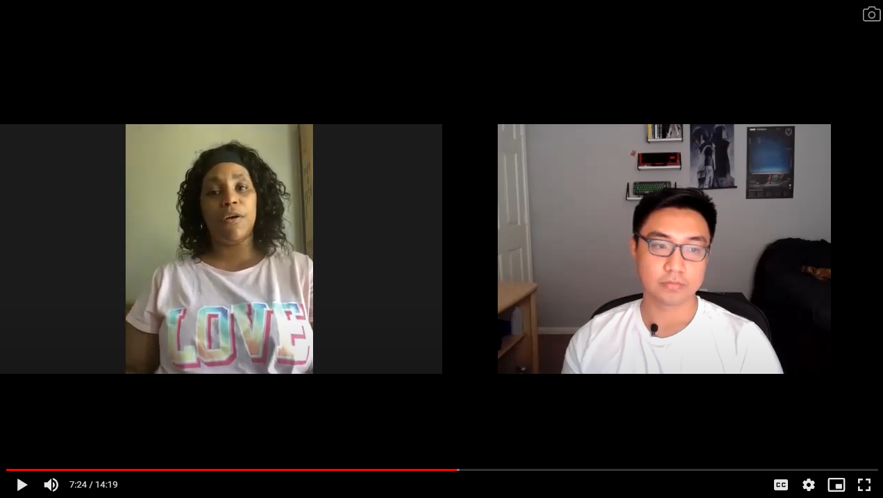
After the interviews, the feedback could pretty much be summed up as:
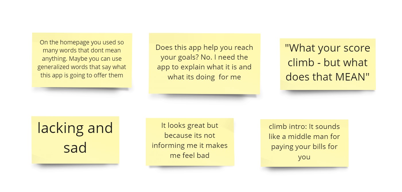
Based on our analysis, the MVP fell short in two key areas
1. We did not do a good enough job communicating the financial engineering aspect of the construct.
2. There is no post-onboarding experience, leaving users confused as to what happens next.
Sometimes, when you set out to answer questions, you don’t necessarily end up with the solution, but with better questions.
We immediately set forth a plan to work on the two shortcomings. Our lead designer would focus on better onboarding communications, while I set to task on creating the post-onboarding experience, seen in the case study below!